Earthquakes Over the Past 7 Days

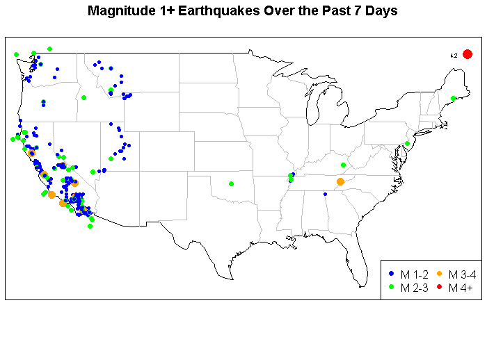
This is a brief example using the maps in R and to highlight a source of data.  This is real-time data and it comes from the U.S. Geological Survey.  This shows the location of earthquakes with magnitude of at least 1.0 in the lower 48 states.

library(maps)
library(maptools)
library(rgdal)

eq = read.table(file=”http://earthquake.usgs.gov/earthquakes/catalogs/eqs7day-M1.txt”, fill=TRUE, sep=”,”, header=T)
plot.new()
my.map <- map("state", interior = FALSE, plot=F) x.lim <- my.map$range[1:2]; x.lim[1] <- x.lim[1]-1; x.lim[2] <- x.lim[2]+1; y.lim <- my.map$range[3:4]; y.lim[1] <- y.lim[1]-1; y.lim[2] <- y.lim[2]+1; map("state", interior = FALSE, xlim=x.lim, ylim=y.lim) map("state", boundary = FALSE, col="gray", add = TRUE) title("Magnitude 1+ Earthquakes Over the Past 7 Days") eq$mag.size <- NULL eq$mag.size[eq$Magnitude>=1 & eq$Magnitude<2] <- .75 eq$mag.size[eq$Magnitude>=2 & eq$Magnitude<3] <- 1.0 eq$mag.size[eq$Magnitude>=3 & eq$Magnitude<4] <- 1.5 eq$mag.size[eq$Magnitude>=4] <- 2.0 eq$mag.col <- NULL eq$mag.col[eq$Magnitude>=1 & eq$Magnitude<2] <- 'blue' eq$mag.col[eq$Magnitude>=2 & eq$Magnitude<3] <- 'green' eq$mag.col[eq$Magnitude>=3 & eq$Magnitude<4] <- 'orange' eq$mag.col[eq$Magnitude>=4] <- 'red' points(x=eq$Lon,y=eq$Lat,pch=16,cex=eq$mag.size, col=eq$mag.col) eq$magnitude.text <- eq$Magnitude eq$magnitude.text[eq$Magnitude<4] <- NA text(x=eq$Lon,y=eq$Lat,col='black',labels=eq$magnitude.text,adj=c(2.5),cex=0.5) legend('bottomright',c('M 1-2','M 2-3','M 3-4','M4+'), ncol=2, pch=16, col=c('blue','green','orange','red')) box() [/sourcecode]

Hurricane Sandy Land Wind Speed and Kriging

NJ Hurricane Sandy Landfall Data

These data come from the National Climatic Data Center (NCDC).  Using the above link will download all of the data collected by the NCDC on the day of Hurricane Sandy.  The data can also be obtained directly from the source at http://cdo.ncdc.noaa.gov/qclcd/QCLCD.

The purpose of this post is not a discussion on kriging or any of its properties. The purpose is to simply provide a simple R example on kriging and how it can be applied on real data.   This R code uses Hurricane Sandy as an example and predicts the wind speed across the state of New Jersey using the measurement stations that the NCDC uses. It is easy to see how this technique can be applied to other data.


wd <- "C:\\nj hurricane data" setwd(wd) my.files <- dir(wd, pattern = ".txt", full.names = TRUE, ignore.case = TRUE) krig <- matrix(NA, nrow=length(my.files), ncol=3) for(i in 1:length(my.files)){ raw <- read.csv(my.files[i], skip=6, header=T) raw <- subset(raw, raw$Date=="20121029") latlongraw <- read.csv(my.files[i], skip=3, header=F, sep="") latlongrows <- head(latlongraw,2)[,2] latlong <- as.numeric(levels(latlongrows)[latlongrows]) raw$WindSpeed[raw$WindSpeed=="M"] <- NA if(is.factor(raw$WindSpeed)){ raw$WindSpeed <- as.numeric(levels(raw$WindSpeed)[raw$WindSpeed]) } krig[i,1] <- latlong[1] krig[i,2] <- latlong[2] krig[i,3] <- max(raw$WindSpeed, na.rm=T) } lat <- krig[,1] long <- krig[,2] s<-cbind(long,lat) PM <- krig[,3] sandy$coords <- s sandy$data <- PM ml <- likfit(sandy, fix.nugget=F, cov.model="exponential", ini = c(10, 5), nugget=4) ml summary(ml) grid <- map("state","new jersey", plot=FALSE) grid.plot <- cbind( c(min(grid$x, na.rm=TRUE),max(grid$x, na.rm=TRUE)), c(min(grid$y, na.rm=TRUE),max(grid$y, na.rm=TRUE)) ) sp1<-seq(grid.plot[1,1]-.25,grid.plot[2,1]+.25,length=100) sp2<-seq(grid.plot[1,2]-.25,grid.plot[2,2]+.25,length=100) sp<-expand.grid(sp1,sp2) inLoc<-map.where("state",x=sp[,1],y=sp[,2]) inLoc[is.na(inLoc)]<-"NA" inLoc<-inLoc=="new jersey" #Perform ordinary Kriging (value of cov.pars and nugget are copied from mle output): pred<-krige.conv(data=PM,coords=s,locations=sp, krige=krige.control(type.krige="ok",cov.model="exponential", cov.pars=c(100,3), nugget=5)) pred$predict[!inLoc]<-NA pred$krige.var[!inLoc]<-NA #Plot the predicted values: image.plot(sp1,sp2,matrix(pred$predict,100,100),zlim=range(PM), main="Sandy Maximum Wind Speed in MPH", xlab="Longitude",ylab="Latitude") map("county",add=T) points(s, pch=16) [/sourcecode]

What Time Is It?

A common scenario that I run into is time and how to deal with it. I often will do a  variety of summaries and analysis that need to be measured at different points in time. Whether I want to graph the data or review the results I need to be able to perform measurements relative to time and interpret the time output in human readable form. R has several functions to handle those time related scenario.

For starters one thing needs to be acknowledged. On Unix based system the beginning of time is January 1, 1970. At that moment exactly zero (0) seconds have passed and it is known as Unix epoch. Anything before that is negative and anything after that time is positive. This measure of time is defined in seconds.

This piece of code shows the Unix epoch and how it compares to the current time.  In this example the origin is zero (0) but as one can see it can easily be changed to calculate the length of time that has past since any given time.

##Local Time in EDT (GMT-5). If local time IS GMT then the date would be January 1, 1970
iso <- ISOdatetime(1969,12,31,19,0,0) # (YYYY,MM,DD,HH,MM,SS) origin <- as.double(iso) t <- Sys.time() curr.time <- as.double(t) curr.time - origin [/sourcecode]   The following bit of code simulates a cumulative process where each consecutive process follows a Poisson distribution  and [latex]\lambda[/latex] (lambda) is a random variable distributed uniformly.  This would be comparable to a process where election vote counts are being collected throughout Election Night. [sourcecode language="css"] set.seed(1234) time.series <- seq(Sys.time(), Sys.time()+4*60*60, by=60*5) #Add 4 hours to time series vals <- matrix(NA, ncol=3, nrow=length(time.series)) for(i in 1:length(time.series)){ if( is.numeric(vals[i-1,1]) & is.numeric(vals[i-1,2]) ){ vals[i,1] <- vals[i-1,1]+rpois(n=1, runif(1, 700,1000)) vals[i,2] <- vals[i-1,2]+rpois(n=1, runif(1, 850,1000)) } else { vals[i,1] <- runif(1, 700,1000) vals[i,2] <- runif(1, 850,1000) } } vals[,3] <- vals[,1]/(vals[,1]+vals[,2]) prop <- vals[,3]*100 prop2 <- (1-vals[,3])*100 plot(time.series,prop, type="o", cex=.6, lty=1, col="blue", pch=1, ylim=c(46,54) , ylab="Percent", xlab="Time of Computation" , main=paste("Example of Cumulative Process Using Time") , sub="Cumulative Proportional Process", cex.sub=.60 , xaxt = "n", yaxt = "n"); lines(time.series, prop2, type="o", cex=.6, lty=1, col="red", pch=4); xaxis.seq.half<- seq(strptime(c(min(time.series)), "%Y-%m-%d %H"), strptime(c(max(time.series)), "%Y-%m-%d %H")+3600, by=1800) xaxis.seq.hour <- seq(strptime(c(min(time.series)), "%Y-%m-%d %H"), strptime(c(max(time.series)), "%Y-%m-%d %H")+3600, by=3600) axis(1, at=(xaxis.seq.hour), tcl = -0.7, lty = 1, lwd = 0.8, labels=FALSE) axis(1, at=(xaxis.seq.half), tcl = -0.3, lty = 2, lwd = 0.5, labels=FALSE) axis(2, at=seq(46,54,by=1), labels=FALSE, tcl = -0.2, lty = 1, lwd = 0.5) axis(2, at=seq(46,54,by=1), labels=TRUE, tcl = -0.7, lty = 1) axis.POSIXct(1, as.POSIXlt(xaxis.seq.hour), at=as.POSIXlt(xaxis.seq.hour), format="%H:%M", tcl = 0.3, las=0, lty = 2, lwd = 0.5, cex.axis=.7, labels=TRUE) [/sourcecode]

One Big Number That’s Not Big Enough

32-bit systems pose an interesting problem because of some of its limitations. These systems are only capable of handling an integer that is  2^{63}-1 = 2147483647.   That is a fairly large number but it just not large enough.  That is particularly true if that number is a phone number (e.g. (214)748-3647).  As you can see there would be a large block of numbers that would cause problems.  In other words a phone number is not an integer and should not be cast as an integer, ever!  Normally on 32-bit systems if an integer exceeds that number it will either kindly return an error or it will send you back in time to the year 1901.  Neither one of those options are very good.  The solution: upgrade to a 64-bit system.  That will allow for a maximum integer of 9,223,372,036,854,775,807.  A 64-bit system will be good for another 292 million years.  The time solution is then solved.  However, it’s not out of the question that there could be a scenario when a researcher will exceed 9.2 quintillion.  This could be the case when dealing with large data mining and trying to analyze something like each grain of sand on a beach.  But I guess then it’s time to upgrade again to something bigger.

Note that when dealing with numbers and computers they normally begin at 0.  So at index 31 you have actually reach the 32nd position and therefore a 32-bit system.  Likewise, 2^{63}-1 = 9223372036854775807.

If you’re not certain then you can quickly find out what the maximum allowable integer by using any of the following lines of code.

In R you can identify the maximum integer:

.Machine$integer.max

In Perl you can identify dates that go back on time:

#!/usr/local/bin/perl

use POSIX;
$ENV{‘TZ’} = “GMT”;

for ($clock = 2147483641; $clock < 2147483651; $clock++) { print ctime($clock); } [/sourcecode] In PHP this is the same as the Perl script: [sourcecode language="css"]

Using R to Compare Hurricane Sandy and Hurricane Irene

Having just lived through two back to back hurricanes (Irene in 2011 and Sandy in 2012) that passed through the New York metro area I was curious how the paths of the hurricanes differed.  I worked up a quick graph in R using data from Unisys.  The data also includes wind speed and barometric pressure.

library(maps)
library(maptools)
library(rgdal)

sandy = read.table(file=”http://weather.unisys.com/hurricane/atlantic/2012/SANDY/track.dat”, skip=3,fill=TRUE)
irene = read.table(file=”http://weather.unisys.com/hurricane/atlantic/2011H/IRENE/track.dat”,skip=3,fill=TRUE)
colnames(sandy) = c(“Advisory”,”Latitude”,”Longitude”,”Time”,”WindSpeed”,”Pressure”,”Status”)
colnames(irene) = c(“Advisory”,”Latitude”,”Longitude”,”Time”,”WindSpeed”,”Pressure”,”Status”)

sandy$WindSpeedColor <- 'blue' sandy$WindSpeedColor[sandy$WindSpeed >= 75] <- 'red' irene$WindSpeedColor <- 'blue' irene$WindSpeedColor[sandy$WindSpeed >= 75] <- 'red' xlim <- c(-88,-65) ylim <- c(25,48) state.list <- c('new york','new jersey','virginia','massachusetts','connecticut','delaware','pennsylvania','maryland','north carolina','south carolina','georgia','florida', 'new hampshire','maine','district of columbia','west virginia','vermont') my.map <- map("state", region = state.list, interior = FALSE, xlim=xlim, ylim=ylim) map("state", region = state.list, boundary = FALSE, col="gray", add = TRUE,xlim=xlim) lines(x=sandy$Longitude,y=sandy$Latitude,col="black",cex=0.75) points(x=sandy$Longitude,y=sandy$Latitude,col=sandy$WindSpeedColor,pch=15,cex=0.9) text(x=sandy$Longitude,y=sandy$Latitude,col='dark green',labels=sandy$Pressure,adj=c(-0.9),cex=0.5) lines(x=irene$Longitude,y=irene$Latitude,col="black",cex=0.75) points(x=irene$Longitude,y=irene$Latitude,col=irene$WindSpeedColor,pch=15,cex=0.9) text(x=irene$Longitude,y=irene$Latitude,col='light green',labels=irene$Pressure,adj=c(-0.9),cex=0.5) title("Path of Hurricane Sandy (2012) and Hurricane Irene (2011)\nwith Wind Speed and Barometric Pressure") legend('topleft',c('Tropical Storm Wind Speeds','Hurricane Wind Speeds'),pch=15, col=c('blue','red')) box() [/sourcecode]  


Mapping Capabilities in R

From time-to-time creating a basic map of the United States or other parts of the world to complement some statistical analysis is useful to emphasize a point. The maps package in R provide a good way to produce these these maps.  These maps axes are based on latitude and longitude so overlaying other information on these maps is quite simple.  Furthermore, it makes a nice addition to geo-spatial analysis.

This is a simple introductory example that is designed to show a couple of different examples.  First, it shows the USA lower 48 states database and how it can be used to create the state boundaries.  Second, the world database is used to add Alaska and Hawaii.  A nice feature is that the colors for each of the state boundaries can be easily changed to group states.   This (non-optimized) code shows a basic example on how to use the maps package to show the Election Day poll closing times for all 50 states and the District of Columbia.

library(maps)
m <- map("state", interior = FALSE, plot=FALSE) m$my.colors <- 0 m$my.colors[m$names %in% c("virginia:main","georgia","vermont","kentucky","indiana","south carolina")] <- 2 m$my.colors[m$names %in% c("west virginia","north carolina:main","ohio")] <- 3 m$my.colors[m$names %in% c("tennessee","rhode island","oklahoma","new jersey","mississippi","massachusetts:main","illinois","maryland","maine","missouri","new hampshire","new jersey","pennsylvania","florida","connecticut","delaware","district of columbia","alabama")] <- 4 m$my.colors[m$names %in% c("arkansas")] <- 5 m$my.colors[m$names %in% c("arizona","colorado","kansas","louisiana","minnesota","michigan:north","michigan:south","nebraska","new york:main","new york:manhattan","new york:staten island","new york:long island","new mexico","north dakota","south dakota","texas","wyoming","wisconsin")] <- 6 m$my.colors[m$names %in% c("iowa","montana","nevada","utah")] <- 7 m$my.colors[m$names %in% c("california","idaho","oregon","washington:main")] <- 8 m.world <- map("world", c("USA","hawaii"), xlim=c(-180,-65), ylim=c(19,72),interior = FALSE) title("Election Day Poll Closing Times") map("state", boundary = FALSE, col="grey", add = TRUE, fill=FALSE) map("state", boundary = TRUE, col=m$my.colors, add = TRUE, fill=TRUE ) map("world", c("hawaii"), boundary = TRUE, col=8, add = TRUE, fill=TRUE ) map("world", c("USA:Alaska"), boundary = TRUE, col='orange', add = TRUE, fill=TRUE ) legend("topright", c('7:00pm','7:30pm','8:00pm','8:30pm','9:00pm','10:00pm','11:00pm','1:00am'), pch=15, col=c(2,3,4,5,6,7,8,'orange'), title="Poll Closing Time (EST)", ncol=2, cex=1.2) [/sourcecode] Because the maps are based on longitude and latitude this package can be extended beyond just county, state and country boundaries and can be used on techniques like kriging and co-kriging to develop model-based maps.