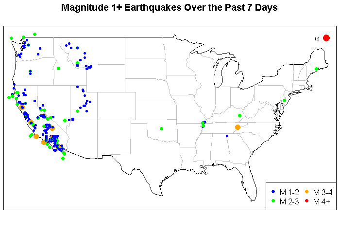
This is a brief example using the maps in R and to highlight a source of data. This is real-time data and it comes from the U.S. Geological Survey. This shows the location of earthquakes with magnitude of at least 1.0 in the lower 48 states.
library(maps)
library(maptools)
library(rgdal)
eq = read.table(file=”http://earthquake.usgs.gov/earthquakes/catalogs/eqs7day-M1.txt”, fill=TRUE, sep=”,”, header=T)
plot.new()
my.map <- map("state", interior = FALSE, plot=F)
x.lim <- my.map$range[1:2]; x.lim[1] <- x.lim[1]-1; x.lim[2] <- x.lim[2]+1;
y.lim <- my.map$range[3:4]; y.lim[1] <- y.lim[1]-1; y.lim[2] <- y.lim[2]+1;
map("state", interior = FALSE, xlim=x.lim, ylim=y.lim)
map("state", boundary = FALSE, col="gray", add = TRUE)
title("Magnitude 1+ Earthquakes Over the Past 7 Days")
eq$mag.size <- NULL
eq$mag.size[eq$Magnitude>=1 & eq$Magnitude<2] <- .75
eq$mag.size[eq$Magnitude>=2 & eq$Magnitude<3] <- 1.0
eq$mag.size[eq$Magnitude>=3 & eq$Magnitude<4] <- 1.5
eq$mag.size[eq$Magnitude>=4] <- 2.0
eq$mag.col <- NULL
eq$mag.col[eq$Magnitude>=1 & eq$Magnitude<2] <- 'blue'
eq$mag.col[eq$Magnitude>=2 & eq$Magnitude<3] <- 'green'
eq$mag.col[eq$Magnitude>=3 & eq$Magnitude<4] <- 'orange'
eq$mag.col[eq$Magnitude>=4] <- 'red'
points(x=eq$Lon,y=eq$Lat,pch=16,cex=eq$mag.size, col=eq$mag.col)
eq$magnitude.text <- eq$Magnitude
eq$magnitude.text[eq$Magnitude<4] <- NA
text(x=eq$Lon,y=eq$Lat,col='black',labels=eq$magnitude.text,adj=c(2.5),cex=0.5)
legend('bottomright',c('M 1-2','M 2-3','M 3-4','M4+'), ncol=2,
pch=16, col=c('blue','green','orange','red'))
box()
[/sourcecode]

Very, very cool stuff. I was playing with your code to look at sales numbers at my company and visualization is definitely more insightly than State groupings. Thank you for sharing!
Thanks for this
You may be interested in a work in progress Shiny app I produced based on your work
associated blog post
That’s great that the post inspired your very cool app. Thanks.
Just found your post, it inspired me to create my own post.
my post 🙂